Design
Designing the heart, again
It looks simple. It is anything but. We talk to the team behind one of this year's most-discussed icon refreshes.
Sasha Reine
May 19, 2026 · 5 min read
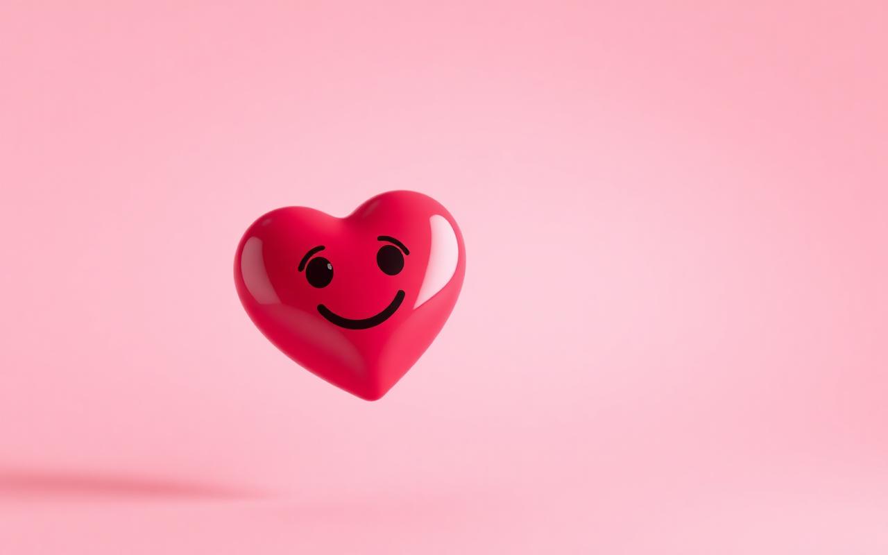
A deceptively hard shape
The heart is one of the smallest, simplest emoji on the keyboard, and one of the most-used. Which means anyone who redraws it is walking into a fight.
The brief
The team had three goals: keep instant recognition at 16px, modernize the silhouette without breaking continuity, and make it feel slightly less plastic. Easier said than done.
- Recognition at 16, 24, and 32 pixels
- A silhouette that survives a single-color rendering
- Highlight placement that suggests three dimensions without going cartoonish
The result
The new heart is a hair taller than the old one, with a softer cleft and a single highlight that's been pulled toward the upper left. Small changes — but the kind of small changes that take six months and roughly forty rounds of review.