The Year of the Soft Smile
A new wave of vendor designs is rounding the edges, warming the palette, and giving the most-used emoji a quiet glow-up.
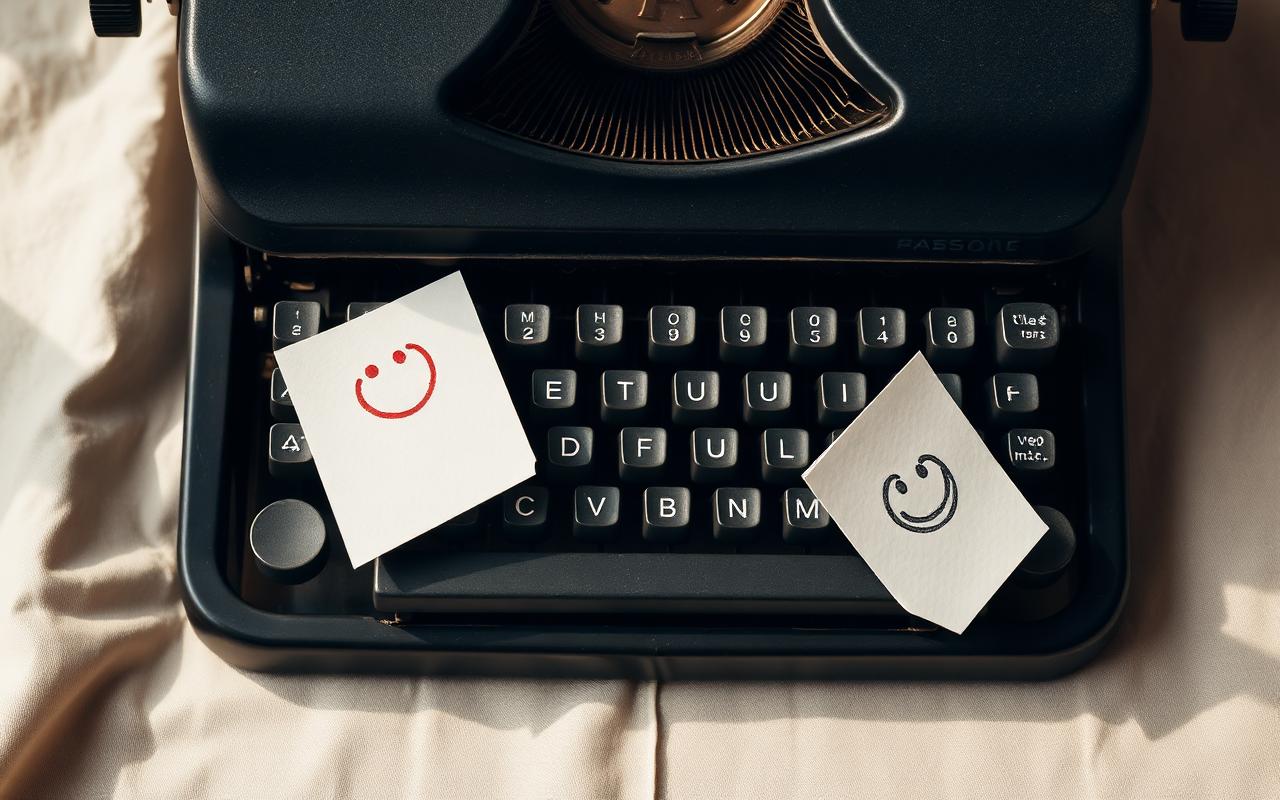
A quieter kind of grin
For the better part of a decade, the smiling face has been a yellow disc with two black dots and an upturned arc. Functional, recognizable, and almost completely uncontroversial. This year, that's beginning to change.
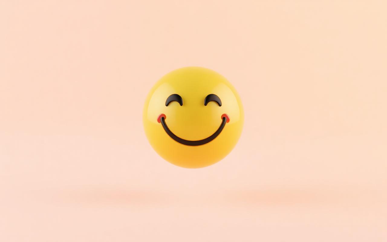
Across three major platform updates this spring, designers have softened the geometry, dialed back the saturation, and added a faint inner glow that gives the classic smile a more dimensional, photographic feel.
When everyone is shouting in bright primary colors, the loudest thing you can do is whisper.
Why it matters
Emoji are visual punctuation, and punctuation is supposed to be invisible. When a smile starts to look harsh or dated, it stops doing its job. The new direction borrows from product design more than illustration: subtle gradients, considered shadows, and a slightly muted yellow that reads warmer on OLED screens.
What's next
Expect to see this approach trickle down to the rest of the face range over the next two release cycles. The hearts and hand gestures will likely follow, and we may finally get a redesign of the much-maligned grinning face with sweat.